【matplotlib】データフレームのグラフ作成方法と主な種類

matplotlibにはx軸・y軸に値を渡してやる方法もありますが、今回はpandasのデータフレームからグラフ生成の方法をご紹介します。
- データフレームからmatplotlibを使ってグラフ作成
- 主なグラフの種類が分かる
- 折れ線グラフ
- 棒グラフ
- 散布図
- ヒストグラム
- 箱ひげ図


ライブラリのインポート
下記ライブラリをインポートします。
import warnings
warnings.simplefilter('ignore')
import pandas as pd
import matplotlib.pyplot as plt
%matplotlib inlineサンプルデータの準備
サンプル用データとして、sklearnからアヤメのデータを持ってきました。
こちらのデータを用いてグラフを作成してみます。
from sklearn.datasets import load_iris
iris = load_iris()
iris_x = pd.DataFrame(iris.data, columns=list(iris.feature_names))

iris_y = pd.DataFrame(iris.target, columns=["target"])
iris_label = {0:'setosa', 1:'versicolor', 2:'virginica'}
iris_y['target'] = iris_y['target'].map(iris_label)

iris_df = pd.concat([iris_x, iris_y], axis=1)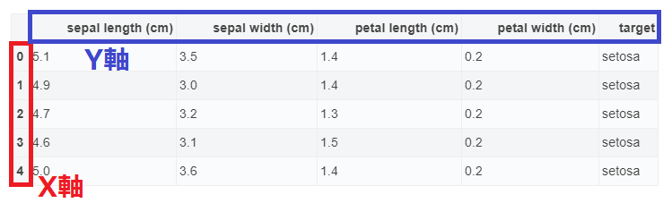
iris_df.head()| sepal length (cm) | sepal width (cm) | petal length (cm) | petal width (cm) | target | |
|---|---|---|---|---|---|
| 0 | 5.1 | 3.5 | 1.4 | 0.2 | setosa |
| 1 | 4.9 | 3.0 | 1.4 | 0.2 | setosa |
| 2 | 4.7 | 3.2 | 1.3 | 0.2 | setosa |
| 3 | 4.6 | 3.1 | 1.5 | 0.2 | setosa |
| 4 | 5.0 | 3.6 | 1.4 | 0.2 | setosa |

データフレームでのグラフの書き方・種類
データフレームからグラフを生成する方法は2種類あります。
df.plot(kind="line")df.plot.line()
kind="line"と引数としてグラフの種類を指定する方法、または関数として呼び出す方法がありますが、基本的には同じ結果になります。
グラフ構成の基本として、x軸はインデックス、y軸は各カラム要素の数値となります。
グラフ化する際に不必要なカラムがある場合には、df[["a","b"]].plot()のようにするか、あらかじめ除外しておきます。
DataFrame.plot()はpandasからmatplotlibを使ってグラフ生成しています。
直接matplotlibを使うmatplotlib.pyplot.plot(x, y)と混同しないように注意してください。
主なグラフの種類・利用用途
| 種類 | 説明 | 利用用途 | 利用シーンの例 |
|---|---|---|---|
| line | 折れ線グラフ | 数量の時系列での増減確認 | 時系列の売上推移 |
| bar, barh | 棒グラフ | 変数間の数量の大きさ比較 | 製品別の売上比較 |
| scatter | 散布図 | 2種類のデータの相関確認 | 商品の売上と気温の関係 |
| hist | ヒストグラム | データの分布確認 | 製品品質の確認 |
| box | 箱ひげ図 | データの分布確認 | 製品品質の確認 |
主な引数
| 引数 | 内容 |
|---|---|
| title | タイトル |
| fontsize | 軸のフォントサイズ |
| legend | Trueを指定すると凡例を表示 |
| color | 色(色の名前,16進数のカラーコード,RGB表記) |
| alpha | 透明度(0〜1) |
| style | スタイル |
| xlim, ylim | 軸の表示領域 |
| grid | Trueを指定するとグリッド線を表示 |
折れ線グラフ
df.plot(kind="line")
iris_df.plot()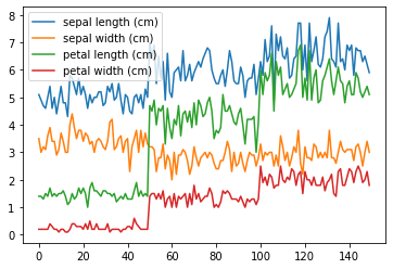
棒グラフ
アヤメの品種毎の平均値を可視化してみます。pandasのgroupbyでまとめました。

iris_target = iris_df.groupby("target").mean()
iris_target| sepal length (cm) | sepal width (cm) | petal length (cm) | petal width (cm) | |
|---|---|---|---|---|
| target | ||||
| setosa | 5.006 | 3.428 | 1.462 | 0.246 |
| versicolor | 5.936 | 2.770 | 4.260 | 1.326 |
| virginica | 6.588 | 2.974 | 5.552 | 2.026 |
縦棒グラフ
df.plot(kind="bar")
iris_target.plot(kind="bar", figsize=(8,5))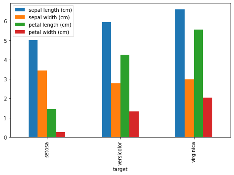
横棒グラフ
df.plot(kind="barh")
iris_target.plot(kind="barh", figsize=(8,8))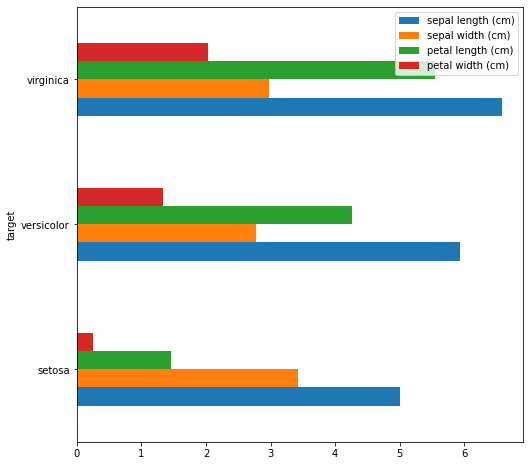
積上げグラフ
df.plot(kind="bar", stacked=True)
積上げ棒グラフを作成する場合は、引数にstacked=Trueを指定します。
iris_target.plot(kind="bar", figsize=(8,5), stacked=True)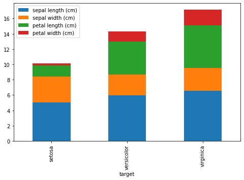
散布図
df.plot(kind="scatter", x, y)
x, yそれぞれに軸データを指定します。
iris_df.plot(kind='scatter', x="sepal length (cm)", y="petal length (cm)")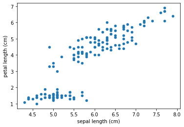
ヒストグラム
df.plot(kind="hist")
ビンのサイズはbins=数値、独立したグラフを作成する際にはsubplots=True。
レイアウト変更の際にはlayout=(行数, 列数)を指定します。
iris_df.plot(kind="hist", alpha=0.5)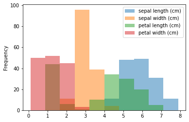
iris_df.plot(kind="hist", subplots=True, layout=(4,1))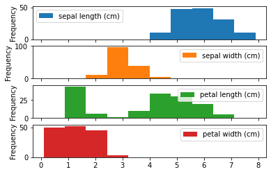
箱ひげ図
df.plot(kind="box")
iris_df.plot(kind="box")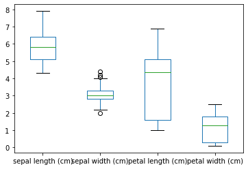
参考
pandas公式ドキュメント:pandas.DataFrame.plot
機械学習・データ処理を学ぶのにおすすめの教材
じっくり書籍で学習するなら!


コメント