【CSS】flexboxレイアウトについて
当ページのリンクには広告が含まれています。
flexboxを使用する際には親要素にdisplay: flexを指定する。
.main {
  display: flex;
}
目次
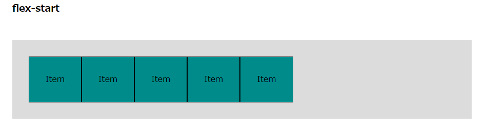
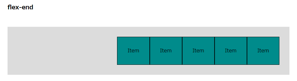
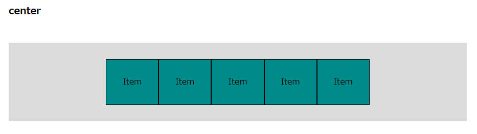
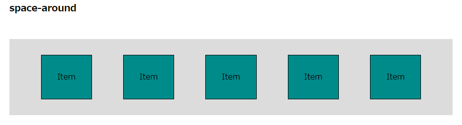
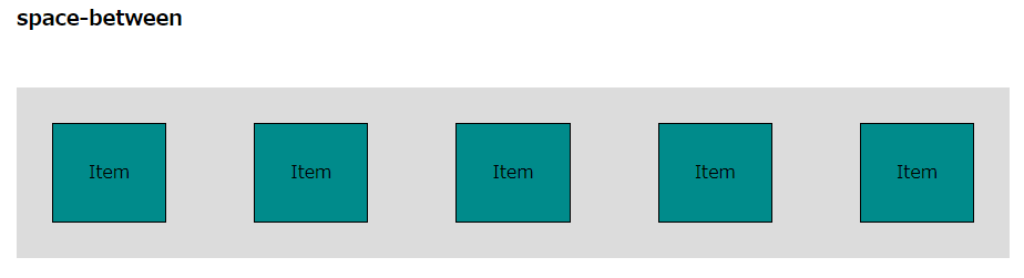
justify-content
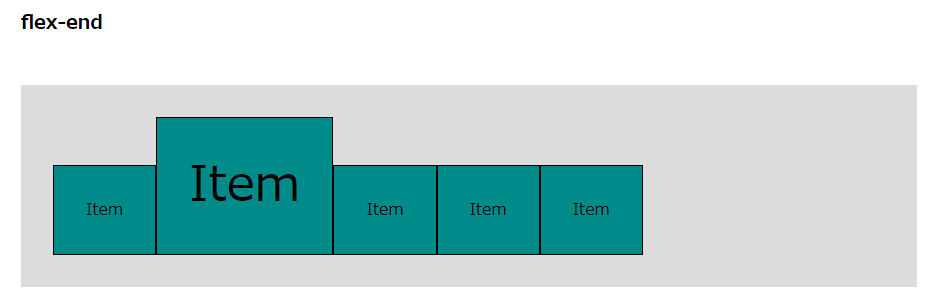
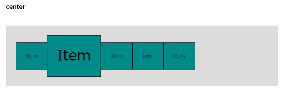
横方向の位置の調整には、justify-contentを使用します。
- flex-start
- flex-end
- center
- space-around
- space-between
.wrapper {
    justify-content: flex-start;
    justify-content: flex-end;
    justify-content: center;
    justify-content: space-around;
    justify-content: space-between;
}
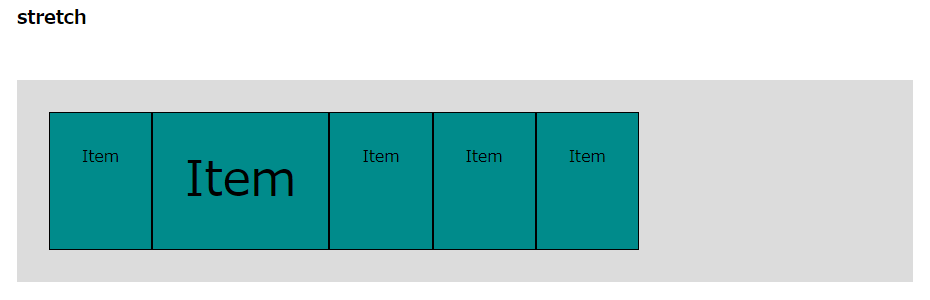
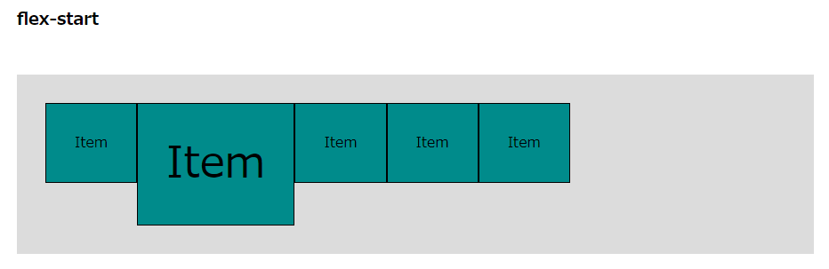
align-items
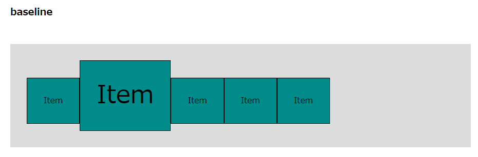
縦方向の位置の調整には、align-itemsを使用します。
- stretch
- flex-start
- flex-end
- center
- baseline
.wrapper {
  align-items: stretch;
  align-items: flex-start;
  align-items: flex-end;
  align-items: center;
  align-items: baseline;
}
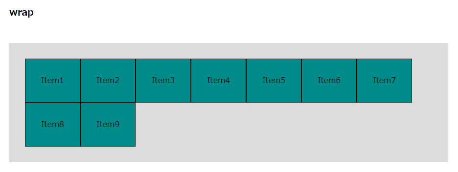
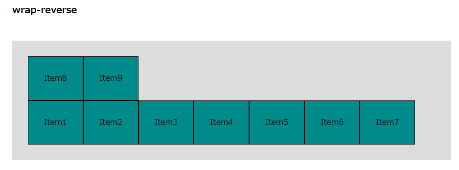
flex-wrap
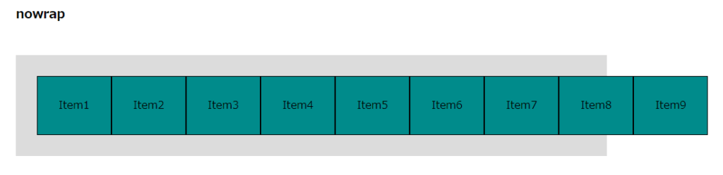
通常flexboxは要素の中にできるだけ入るようにしますが、折り返したりする場合にはflex-wrapを使用します。
- nowrap: 初期値
- wrap: 折り返し
- wrap-reverse: 逆に折り返し
.wrapper {
    flex-wrap: nowrap;
    flex-wrap: wrap;
    flex-wrap: wrap-reverse;
}
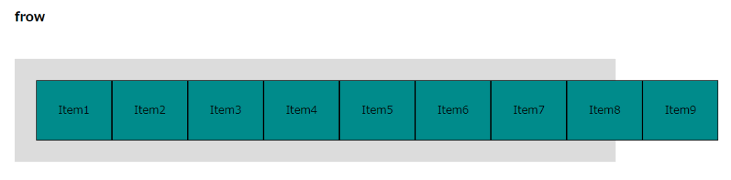
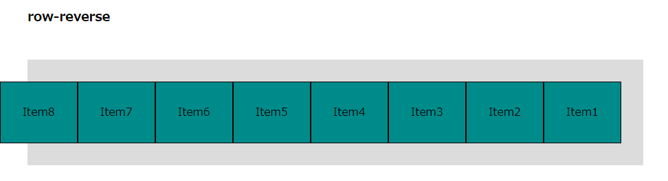
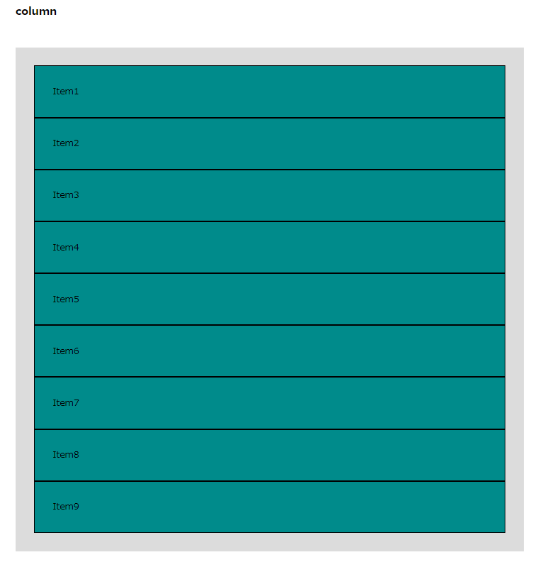
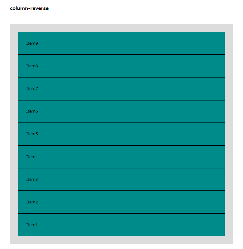
flex-direction
方向についてです。rowかcolumnかをflex-directionを指定します。
- row
- row-reverse
- column
- column-reverse
.wrapper {
  flex-direction: row;
  flex-direction: row-reverse;
  flex-direction: column;
  flex-direction: column-reverse;
}
コメント