【matplotlib】グラフの装飾やスタイルの変更方法【まとめ】

matplotlibを使っていると、細かい関数をよく忘れませんか?
私はよく忘れてしまいそのたびに調べてしまうので、グラフで使う基本操作をまとめてみました。
matplotlibでの細かい装飾方法が分かる
データフレームからグラフ作成方法は、下記をご参照ください。


ライブラリのインポート
import matplotlib.pyplot as plt
import numpy as np
import japanize_matplotlib
%matplotlib inline必要なライブラリをインポートします。japanize_matplotlibはグラフ描写の際に文字化け防止用のライブラリです。
インストールは
pip install japanize-matplotlib
conda install japanize-matplotlib
でお願いします。
タイトル・ラベル・凡例のつけ方
タイトル
plt.title(タイトル名)
グラフにタイトルを追加する場合はplt.title("タイトル名")でタイトル名を記入します。
x = ["朝","昼","夕","夜"]
y = [36.5,36.2,37.5,37.2]

plt.plot(x, y)
plt.title("2021-01-05の体温")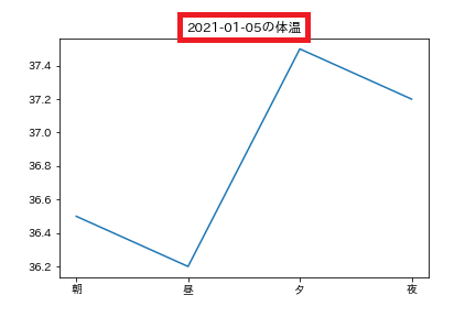
軸ラベル
plt.xlabel(ラベル名)plt.ylabel(ラベル名)
それぞれX軸、Y軸に対応しています。
軸ラベルを追加する場合は引数に名称を追加します。
x = ["朝","昼","夕","夜"]
y = [36.5,36.2,37.5,37.2]

plt.plot(x, y)
plt.title("2021-01-05の体温")
plt.ylabel("体温(℃)")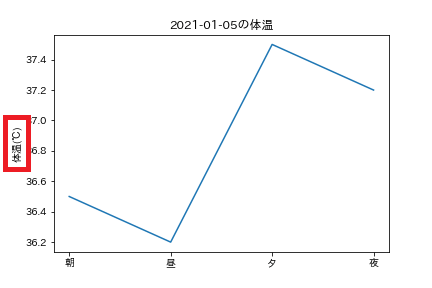
凡例
plt.plot(x, y, label="ラベル名")plt.legend(loc="表示位置")
プロットする際にラベル名を指定しておき、plt.legend()で表示します。plt.legend()の引数:locで任意の位置に表示できます。
引数を指定しない場合は、最適な位置に調整してくれます。
| locの引数 | right(左) | center(中央) | left(右) |
| upper(上) | upper right | upper center | upper left |
| center(中央) | center right | center | center left |
| lower(下) | lower right | lower center | lower left |
x = ["朝","昼","夕","夜"]
y_c = [36.5,36.2,37.5,37.2]
y_f = [36.2,36.5,36.8,36.3]
y_m = [35.8,35.9,36.2,36.5]

plt.plot(x, y_c, label="子")
plt.plot(x, y_f, label="父")
plt.plot(x, y_m, label="母")

plt.title("2021-01-05の体温")
plt.ylabel("体温(℃)")

plt.legend(loc="upper left")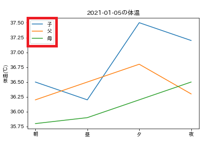
フォントサイズ・グラフカラーの変更
フォントサイズ
plt.title(title, fontsize=サイズ)
fontsizeで大きさを数字で指定します。
タイトル以外にも、ラベルや凡例のサイズの変更も可能です。
x = ["朝","昼","夕","夜"]
y_c = [36.5,36.2,37.5,37.2]
y_f = [36.2,36.5,36.8,36.3]
y_m = [35.8,35.9,36.2,36.5]

plt.plot(x, y_c, label="子")
plt.plot(x, y_f, label="父")
plt.plot(x, y_m, label="母")

plt.title("2021-01-05の体温", fontsize=20)
plt.ylabel("体温(℃)")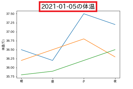
グラフカラー
plt.plot(x, y, color=色の指定)
colorで色の指定が可能です。
引数のcolorはcと短縮可能で、一部の色も短縮表記可能です。
plt.plot(x, y, c="r")
| 文字 | 色 |
|---|---|
| ‘b’ | blue |
| ‘g’ | green |
| ‘r’ | red |
| ‘c’ | cyan |
| ‘m’ | magenta |
| ‘y’ | yellow |
| ‘k’ | black |
| ‘w’ | white |
x = ["朝","昼","夕","夜"]
y_c = [36.5,36.2,37.5,37.2]
y_f = [36.2,36.5,36.8,36.3]
y_m = [35.8,35.9,36.2,36.5]

plt.plot(x, y_c, label="子", color="red")
plt.plot(x, y_f, label="父", color="orange")
plt.plot(x, y_m, label="母", color="blue")

plt.title("2021-01-05の体温", fontsize=20)
plt.ylabel("体温(℃)")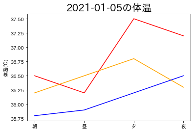
線のスタイル・太さ・透明度の変更
線のスタイル
plt.plot(x, y, linestyle="線の種類")
linestyleで線の種類を指定できます。
引数名はlsと省略可能です。
| 文字 | 名前 | 説明 |
|---|---|---|
| ‘-‘ | solid | 実線 |
| ‘–‘ | dashed | 破線 |
| ‘-.’ | dash-dot | 一点鎖線 |
| ‘:’ | dotted | 点線 |
x = ["朝","昼","夕","夜"]
y_c = [36.5,36.2,37.5,37.2]
y_f = [36.2,36.5,36.8,36.3]
y_m = [35.8,35.9,36.2,36.5]

plt.plot(x, y_c, linestyle="solid", label="solid")
plt.plot(x, y_f, ls="--", label="dashed")
plt.plot(x, y_m, ls=":", label="dotted")

plt.title("2021-01-05の体温", fontsize=20)
plt.ylabel("体温(℃)")
plt.legend()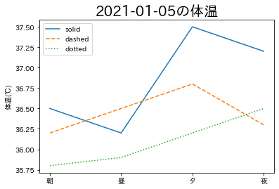
線の太さ
plt.plot(x, y, linewidth=線の太さ)
linewidthで線の太さを指定できます。
引数名はlwと省略でき、数値で太さを指定します。
x = ["朝","昼","夕","夜"]
y_c = [36.5,36.2,37.5,37.2]
y_f = [36.2,36.5,36.8,36.3]
y_m = [35.8,35.9,36.2,36.5]

plt.plot(x, y_c, linewidth=10, label="10 width")
plt.plot(x, y_f, lw=5, label="5 width")
plt.plot(x, y_m, lw=1, label="1 width")

plt.title("2021-01-05の体温", fontsize=20)
plt.ylabel("体温(℃)")
plt.legend()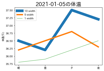
透明度
plt.hist(data, alpha=透明度)
alphaで透明度を指定できます。
主にヒストグラムのグラフで使われますが、他のグラフでも使用可能です。
透明度は0~1の間で指定します。
np.random.seed(250)
x1 = np.random.rand(50)
x2 = np.random.rand(30)

plt.hist(x1, alpha=0.5)
plt.hist(x2, alpha=0.5)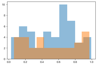
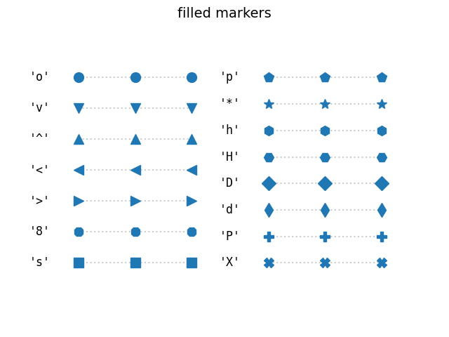
マーカーの種類の変更
plt.scatter(x, y, marker=マーカーの種類)
markerでマーカーの種類を変更で来ます。
主に、折れ線グラフや散布図での使用を想定しています。
np.random.seed(250)
x1 = np.random.randn(50)
x2 = np.random.rand(30)

y1 = np.random.randn(50)
y2 = np.random.rand(30)

plt.scatter(x1, y1, marker="^")
plt.scatter(x2, y2, marker="x")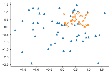
グリッド・補助線の追加
グリッド
plt.grid()
グリッド線を引く場合はplt.grid()とします。
X軸もしくはY軸のみ線を引く場合には、引数にaxis="x" or "y"をとります。
np.random.seed(250)
x1 = np.random.randn(50)
x2 = np.random.rand(30)

y1 = np.random.randn(50)
y2 = np.random.rand(30)

plt.scatter(x1, y1, marker="^")
plt.scatter(x2, y2, marker="x")
plt.grid()
補助線
plt.hlines(y座標, x座標の最小値(始点), x座標の最大値(終点))
plt.vlines(x座標, y座標の最小値(始点), y座標の最大値(終点))
hlinesが横線、vlinesが縦線になります。
np.random.seed(250)
x = np.random.randn(50)
y = np.random.randn(50)

plt.scatter(x, y, marker="^")

plt.hlines(y.mean(), x.max(), x.min(), ls="--", color="black")
plt.vlines(x.mean(), y.max(), y.min(), ls="--", color="black")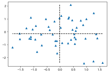
軸の表示領域
plt.xlim(横軸下限値,横軸上限値)
plt.ylim(縦軸下限値,縦軸上限値)
X軸、Y軸の表示領域の上限・下限値を変更できます。
x = ["朝","昼","夕","夜"]
y_c = [36.5,36.2,37.5,37.2]
y_f = [36.2,36.5,36.8,36.3]
y_m = [35.8,35.9,36.2,36.5]

plt.plot(x, y_c, label="子")
plt.plot(x, y_f, label="父")
plt.plot(x, y_m, label="母")

plt.title("2021-01-05の体温", fontsize=20)
plt.ylabel("体温(℃)")

plt.xlim("朝","夜")
plt.ylim(35,38)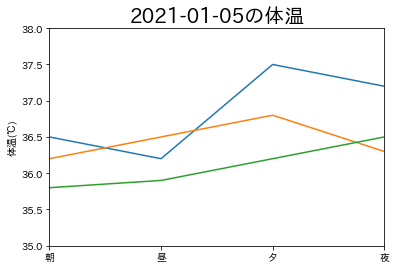
グラフの保存方法
plt.savefig("ファイル名")
引数:dpi=300など任意の解像度に可能。指定しない場合は100
引数:bbox_inches="tight"で余白除去が可能
x = ["朝","昼","夕","夜"]
y_c = [36.5,36.2,37.5,37.2]
y_f = [36.2,36.5,36.8,36.3]
y_m = [35.8,35.9,36.2,36.5]

plt.plot(x, y_c, label="子")
plt.plot(x, y_f, label="父")
plt.plot(x, y_m, label="母")

plt.title("2021-01-05の体温", fontsize=20)
plt.ylabel("体温(℃)")

plt.xlim("朝","夜")
plt.ylim(35,38)
plt.savefig("test.png", dpi=300, bbox_inches="tight")
参考
matplotlibドキュメント:matplotlib.pyplot
機械学習・データ処理を学ぶのにおすすめの教材
じっくり書籍で学習するなら!


コメント